Calligraphy as a Bridge Between Tibetan Script and Modern Writing
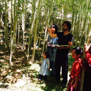
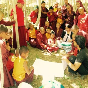
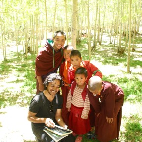
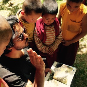
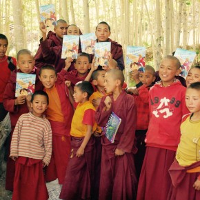
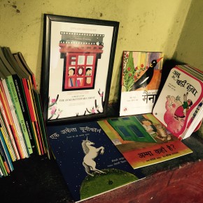
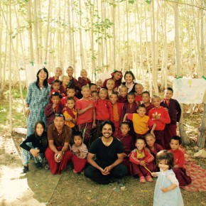
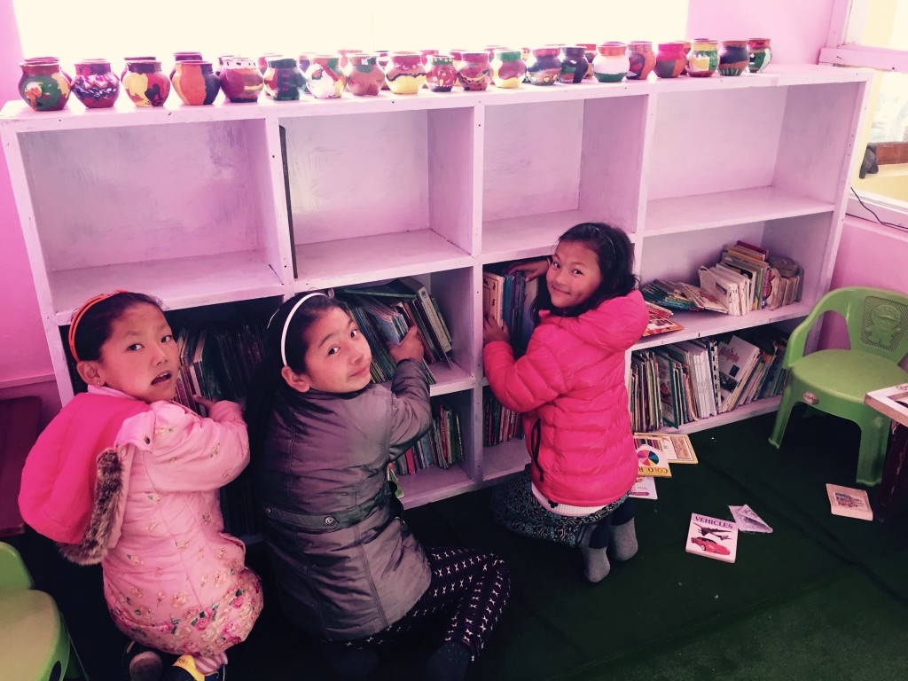
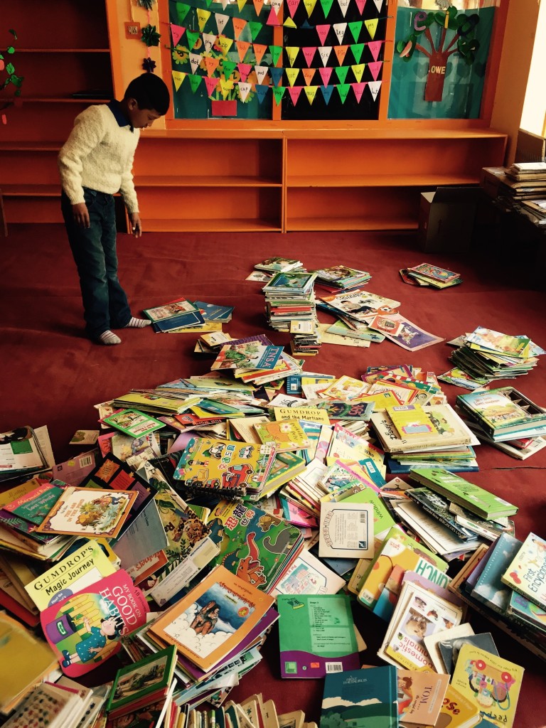
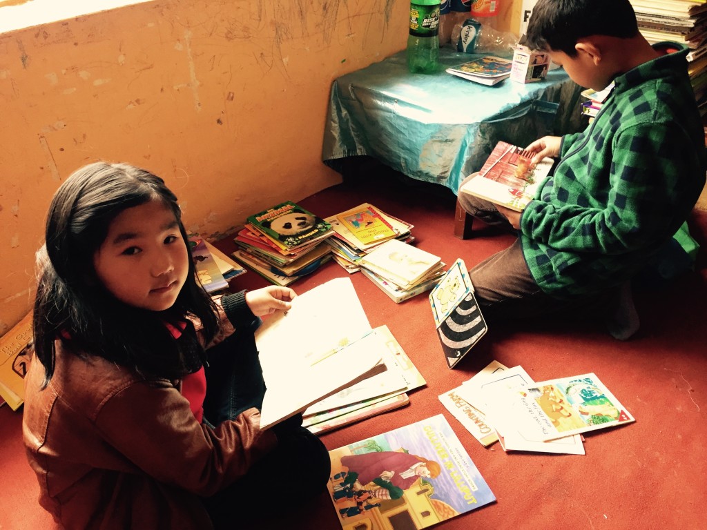
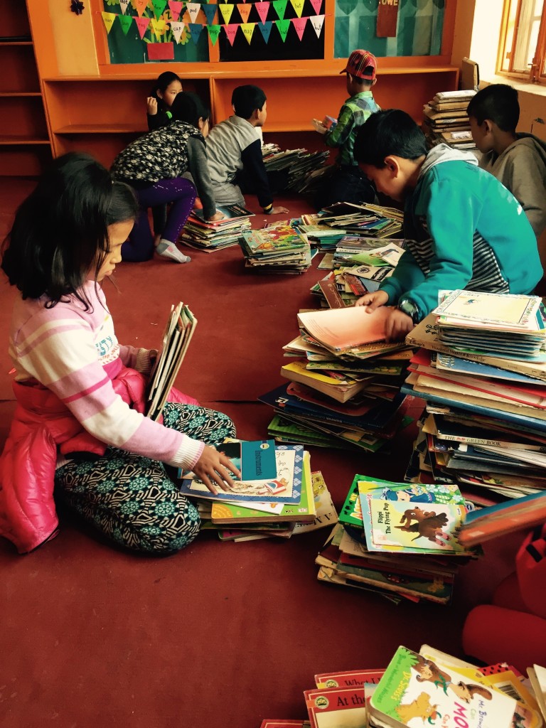
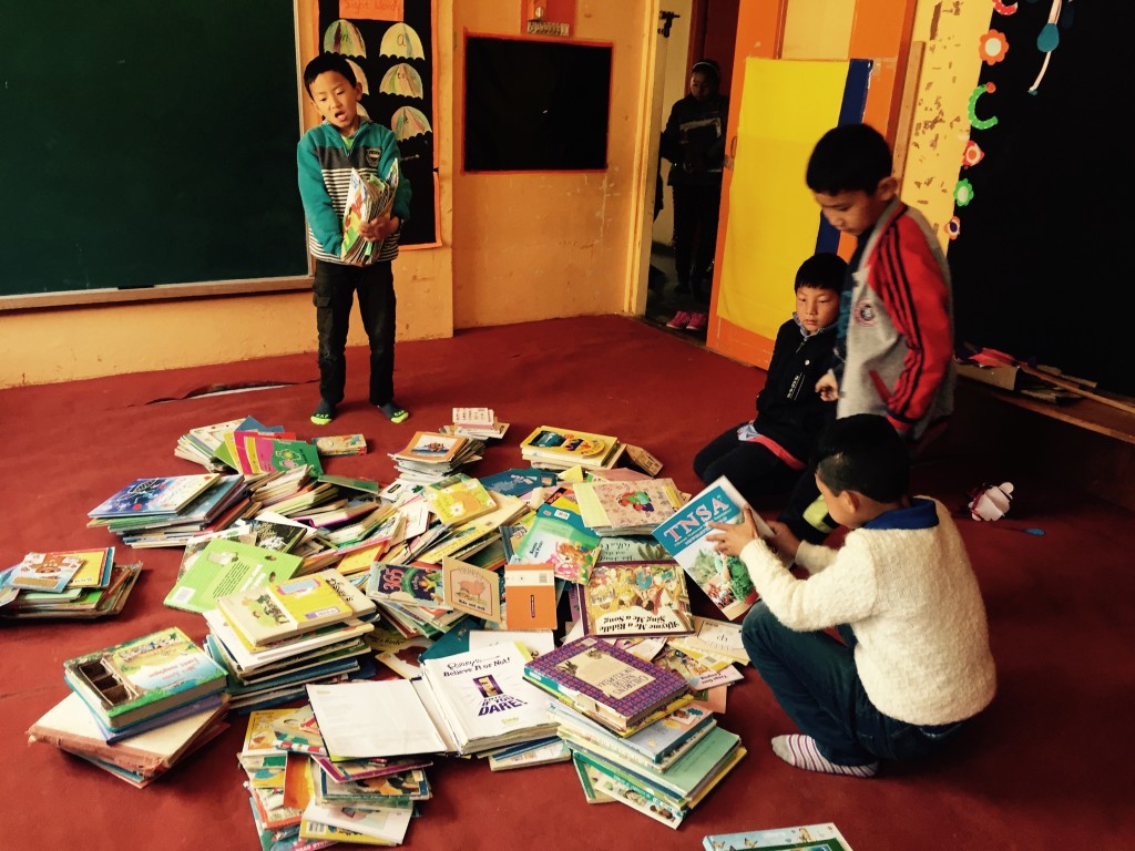
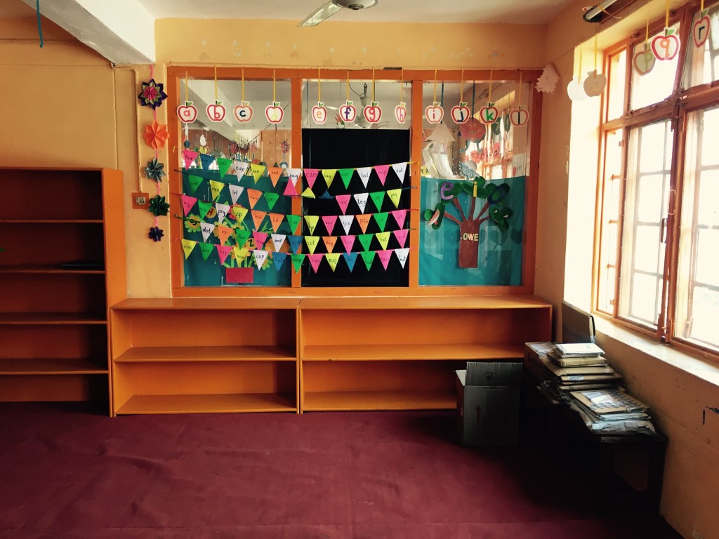
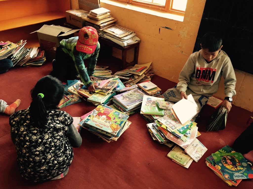
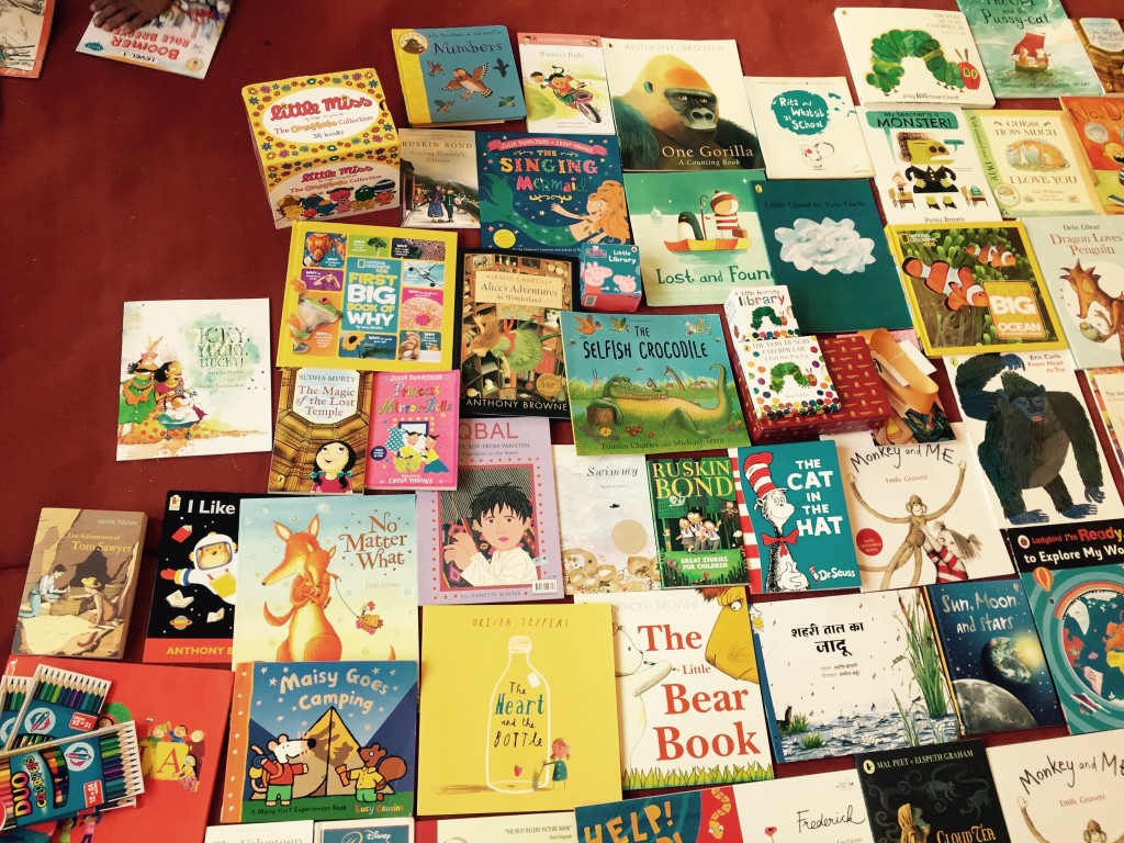
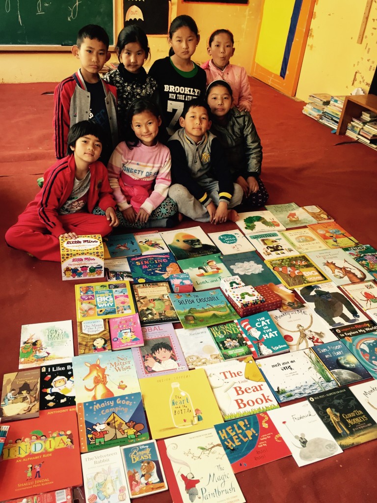
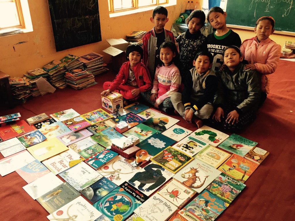
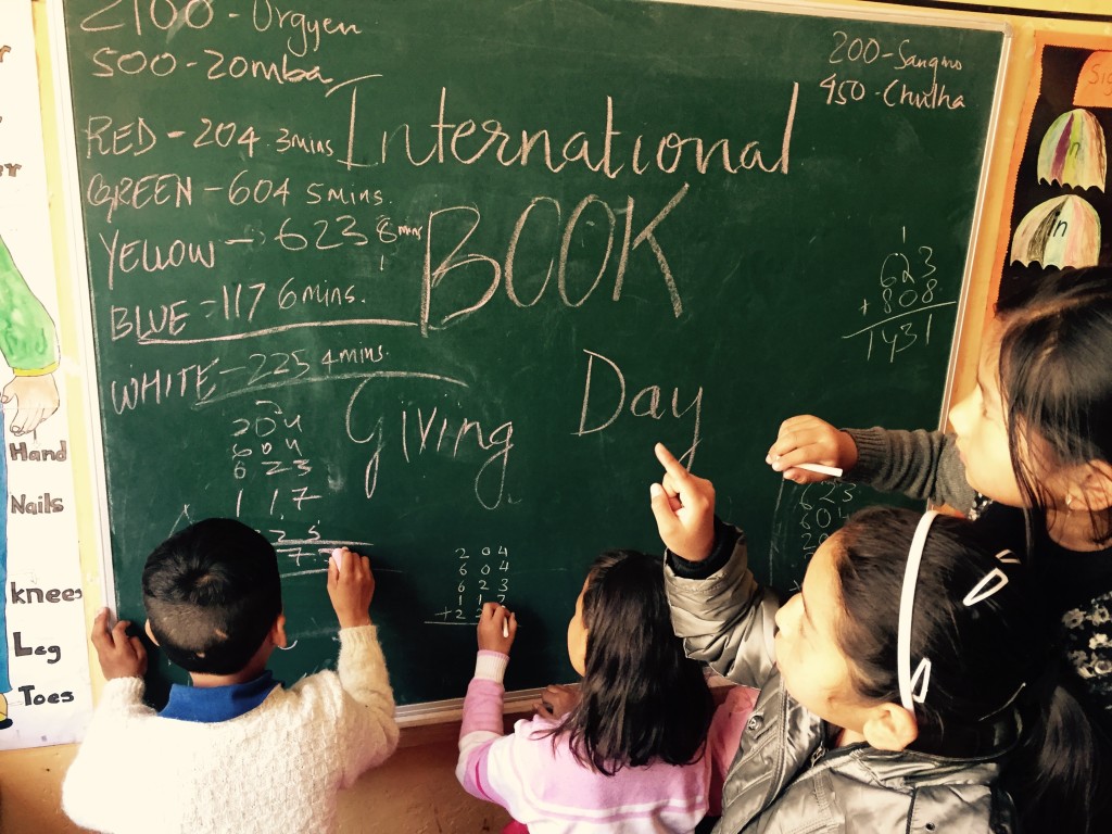
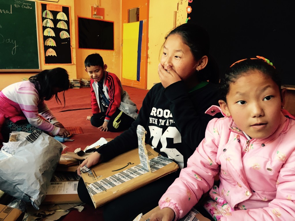
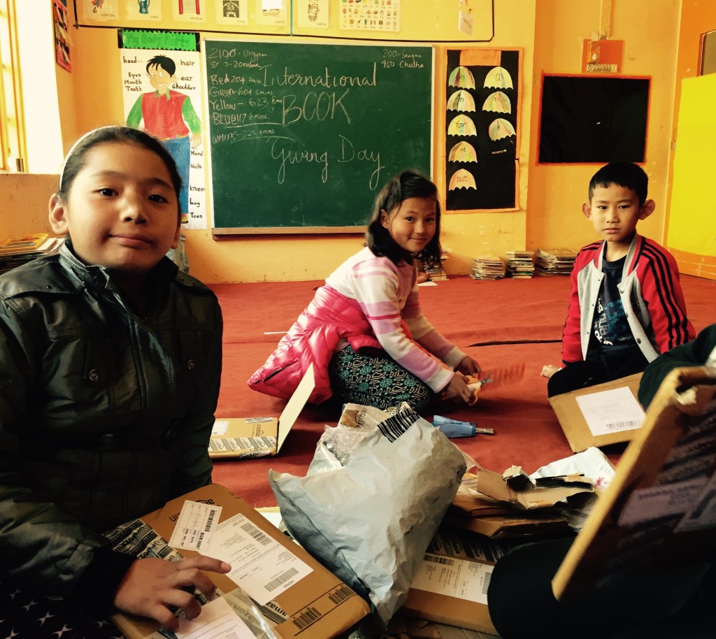
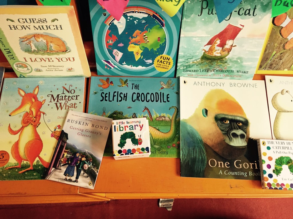
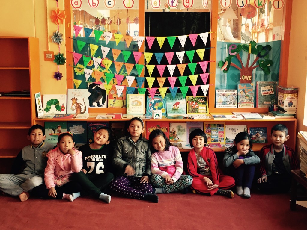
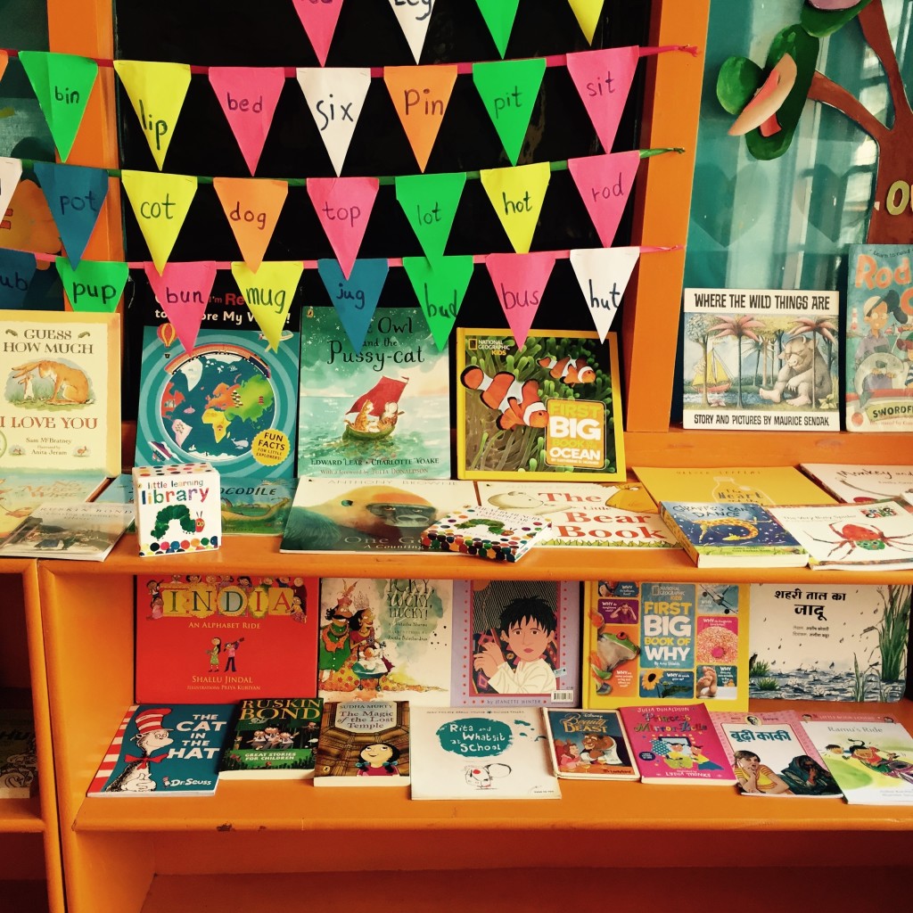
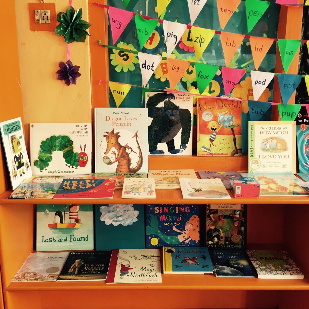
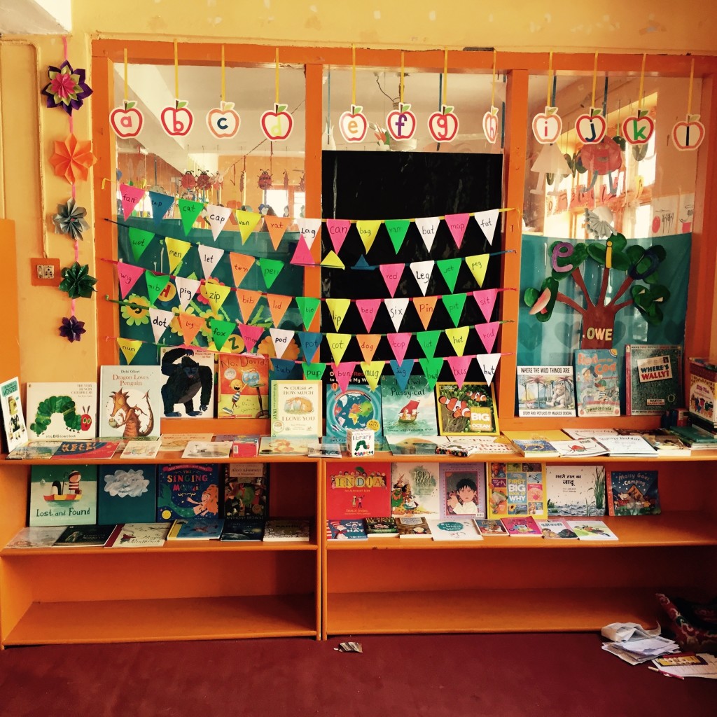
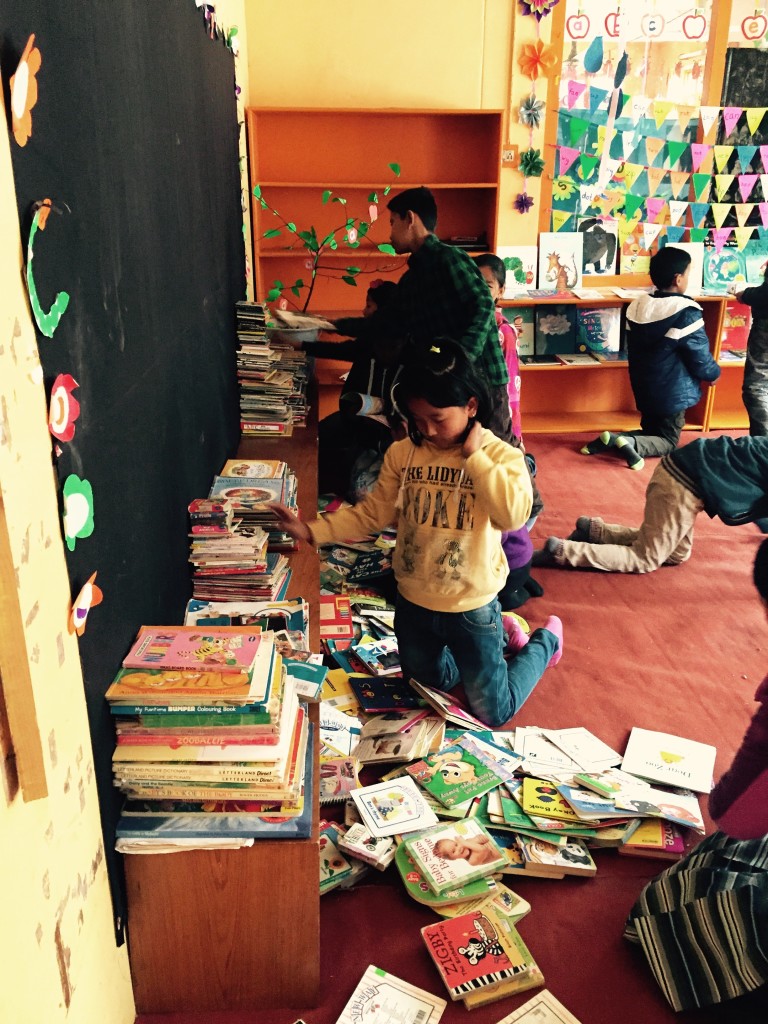
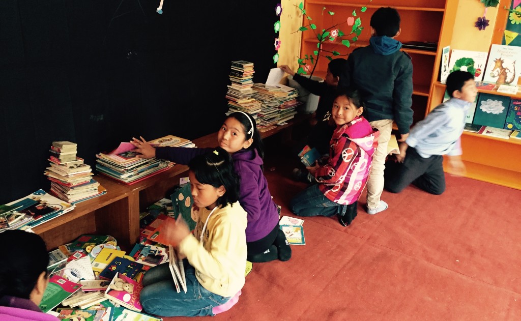
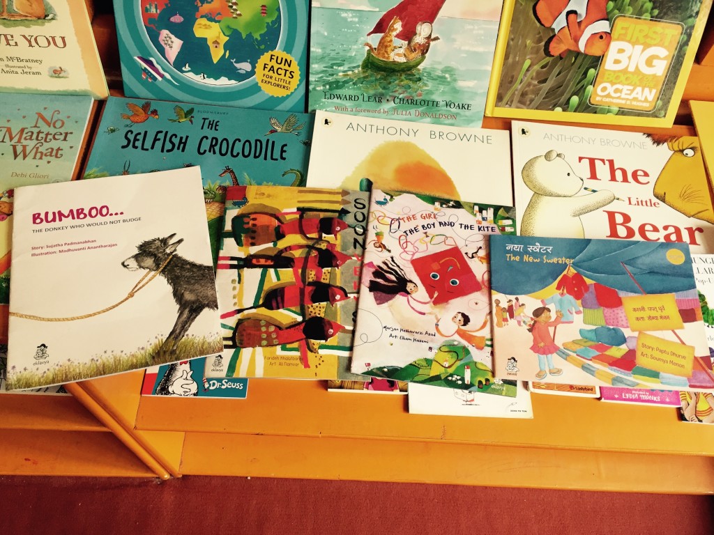
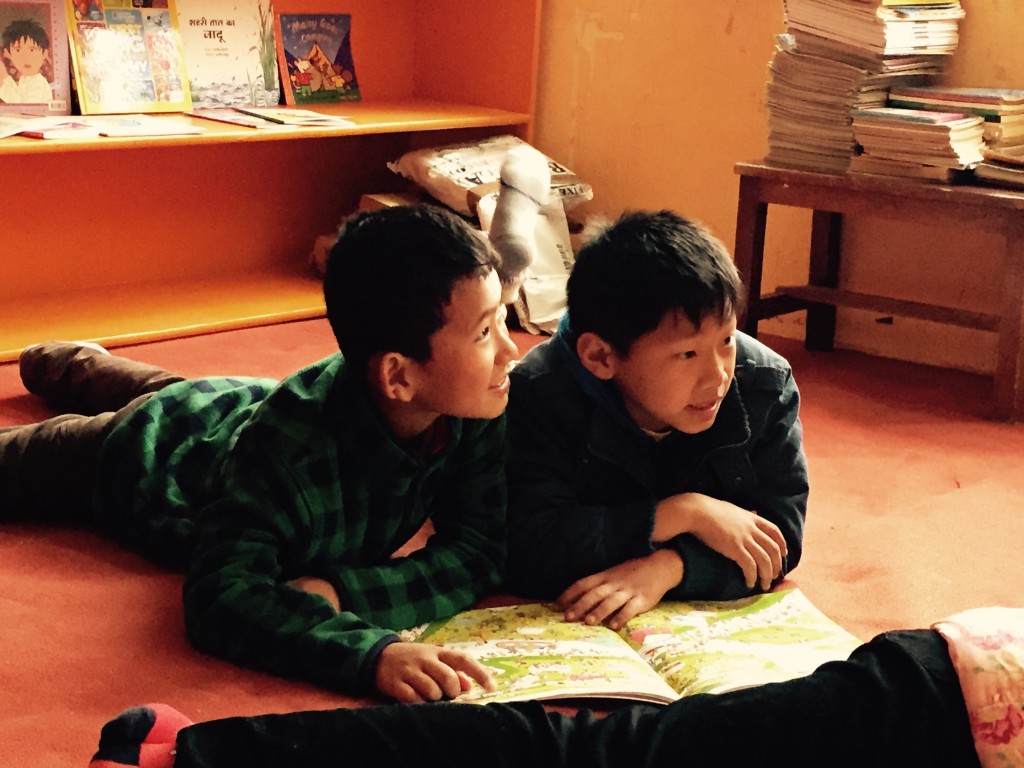
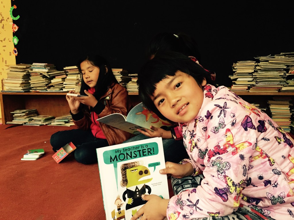
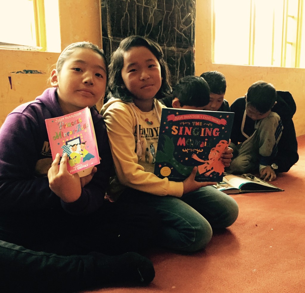
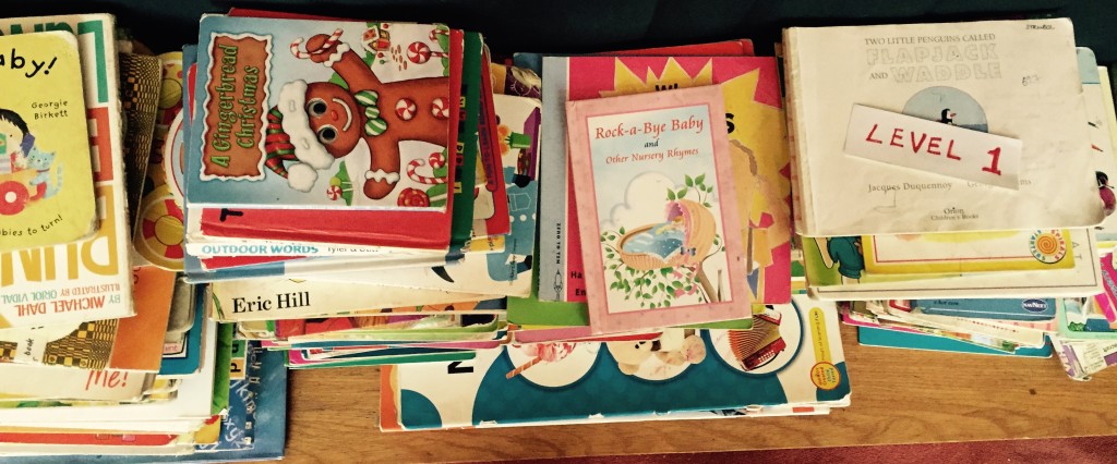
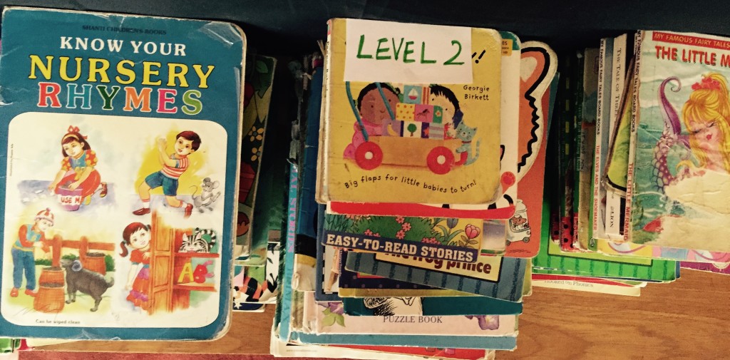
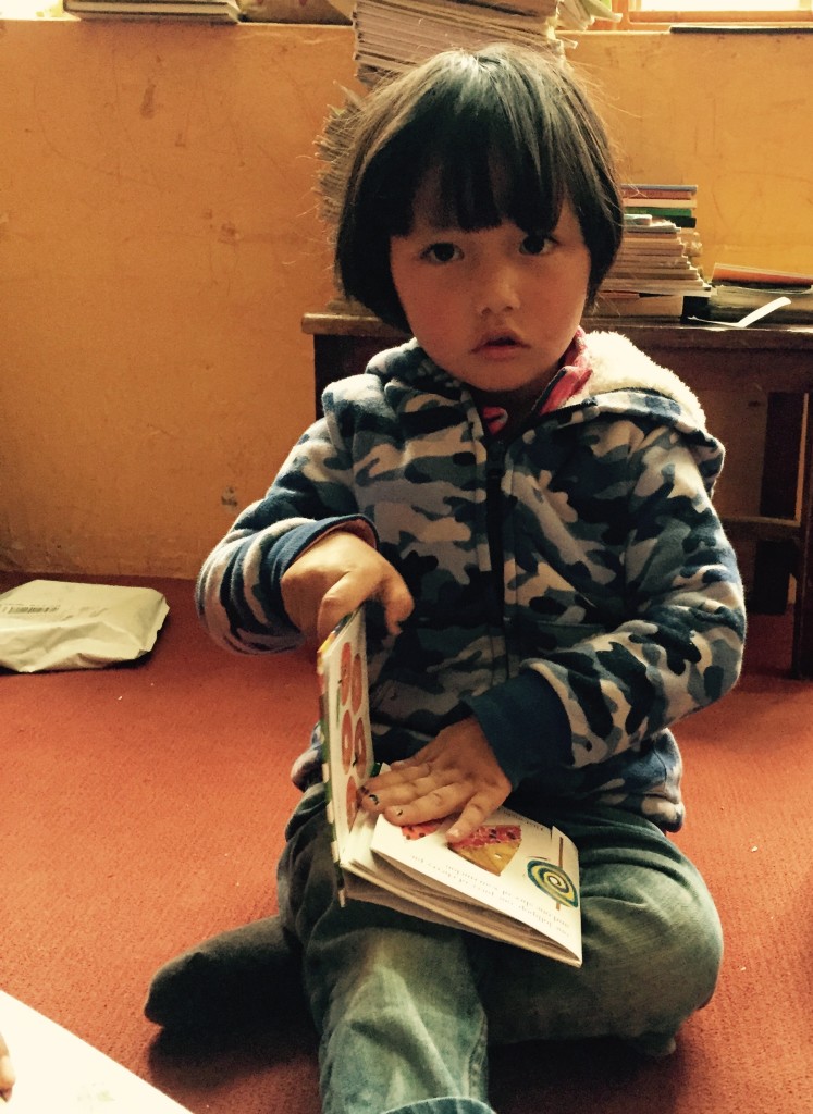
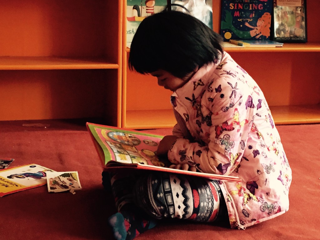
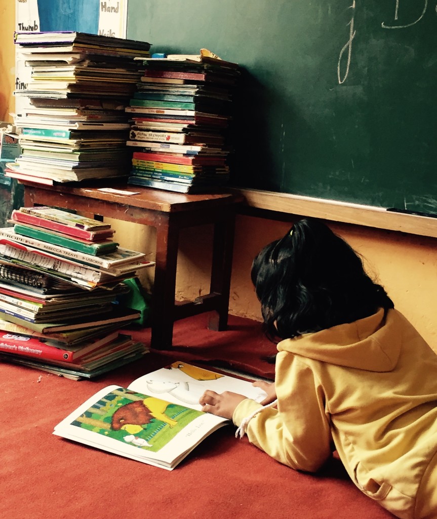
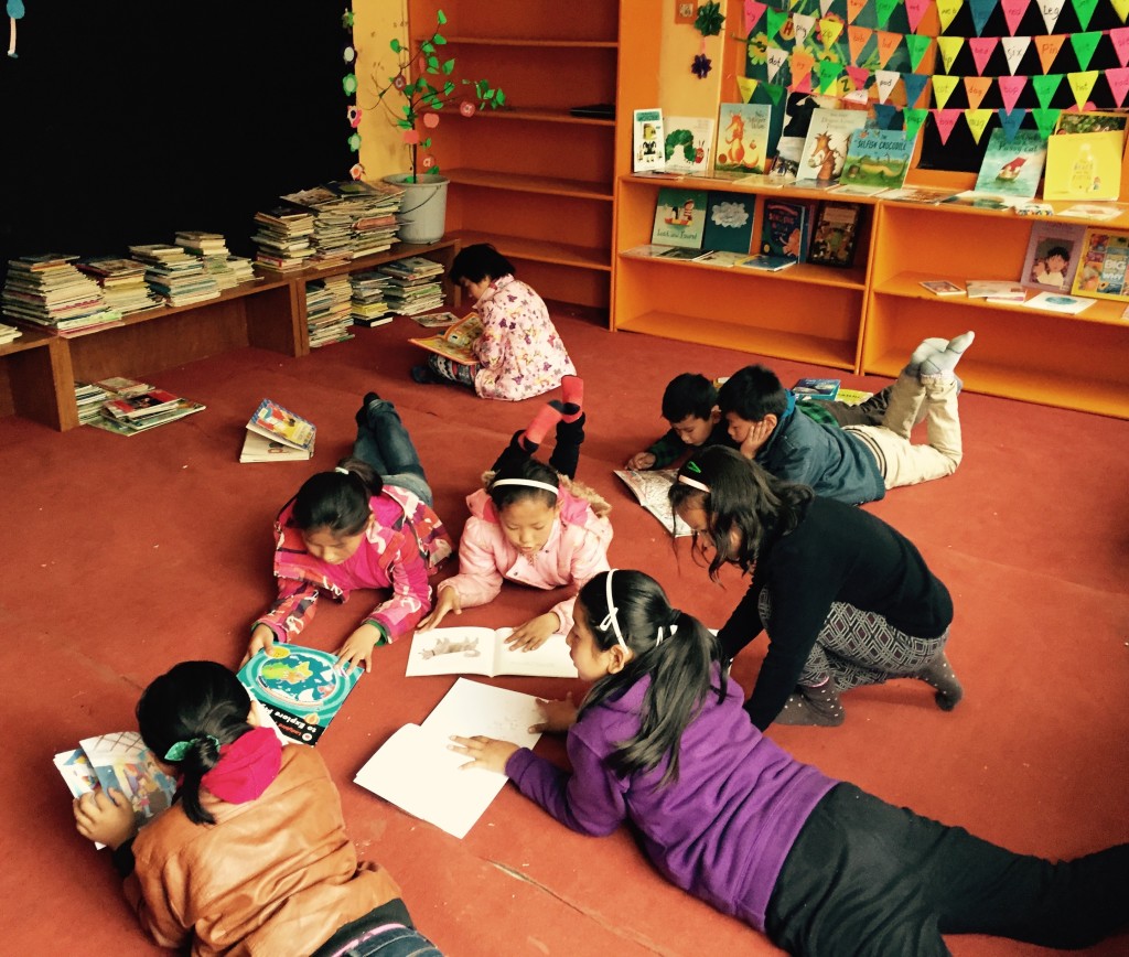
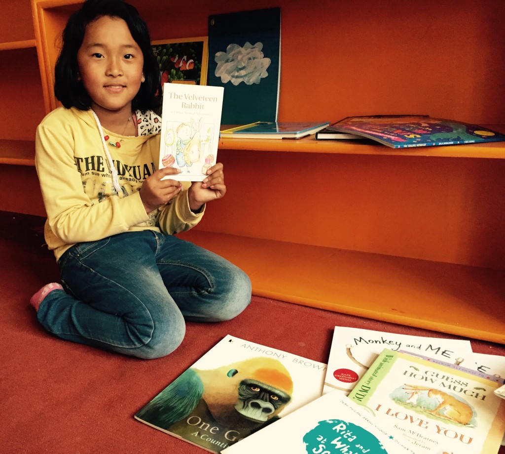
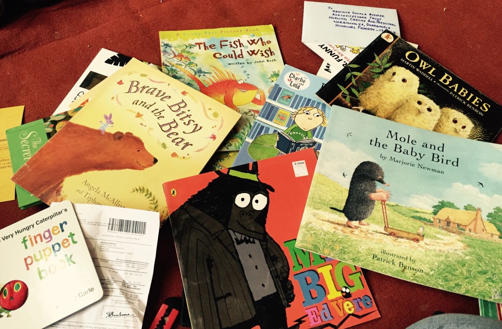
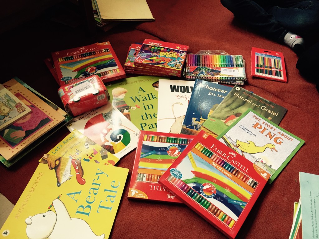
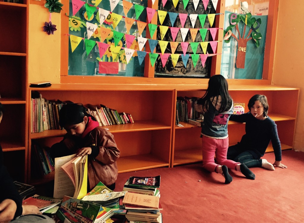
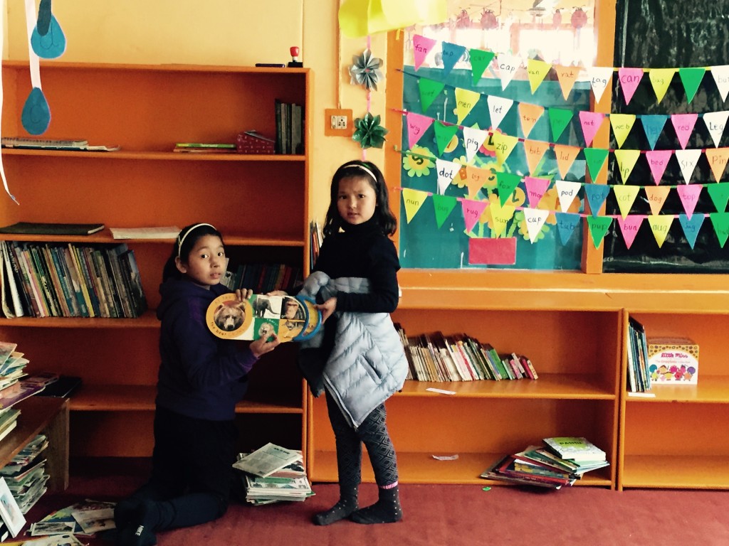
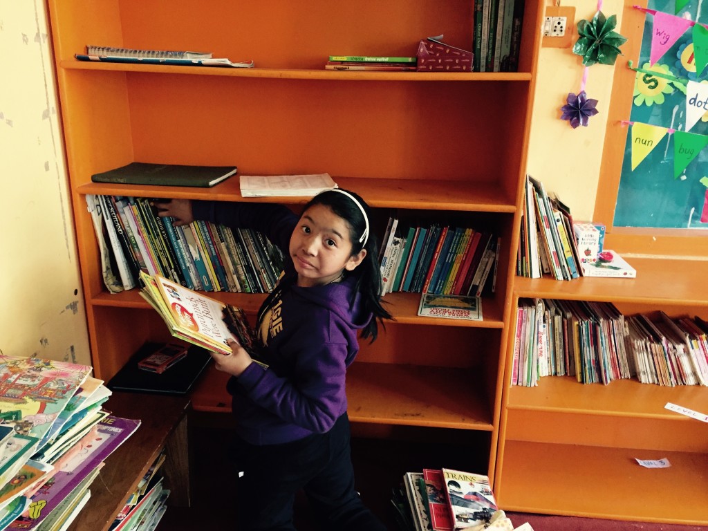
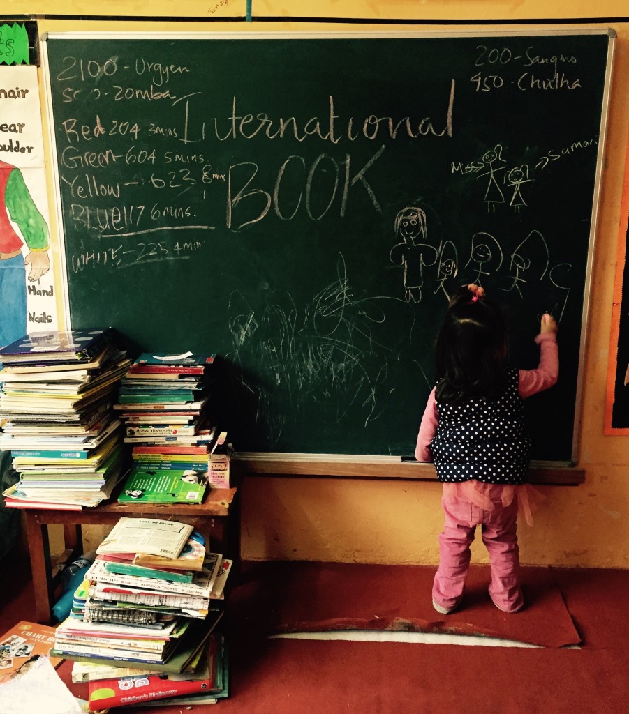
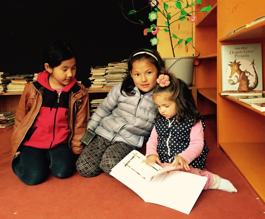
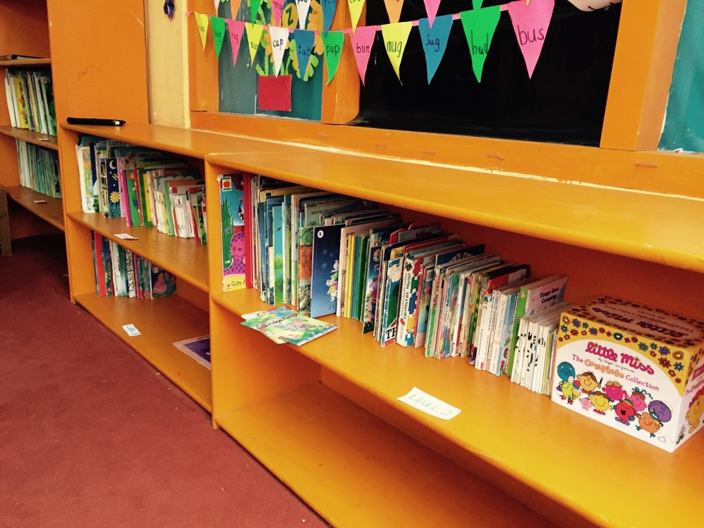
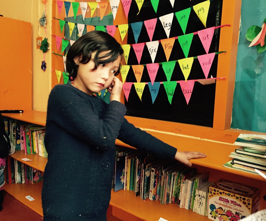
Learning to shape a Tibetan letter can do more than strengthen fine-motor control. It can connect young learners with the visual logic of books while opening a conversation with notebooks, posters and screens. In Ladakh, the educational work of Avalokiteśvara Trust supports children and young monks through reading rooms, book drives and creative activities, showing how literacy, art and music can grow together rather than compete for time.
Calligraphy makes the construction of writing visible. Learners examine head lines, stems, bowls, spacing, stroke direction and rhythm, then discover how shape affects tone and reading. The aim is not to train every child as a monastic scribe or to rank one script above another. It is to treat handwriting as a bridge: rooted in cultural knowledge, yet able to connect with digital communication and contemporary creative work.
| Aspect |
Tibetan calligraphic study |
Connection with modern writing |
| Letter structure |
Proportion, spacing, stroke order and rhythmic repetition |
Clearer handwriting, layout awareness and attention to legibility |
| Tools |
Brushes, bamboo pens, fine markers and prepared paper |
Comparison of traditional and digital tools |
| Creative process |
Observation, disciplined copying and gradual personal adjustment |
Graphic design, digital typography and visual communication |
| Cultural value |
Connection with Tibetan books, language and lived heritage |
Dialogue among languages, technologies and forms of expression |
The grammar inside Tibetan letterforms
Formal exercises often begin with dbu chen, commonly called Uchen, the clear script used in many printed Tibetan books. Tibetan writing runs from left to right and top to bottom. Its letters share a top line while differing in stems, curves and lower forms. Vowel marks, syllable separators and punctuation affect their appearance, so learners study relationships rather than treating characters as isolated symbols.
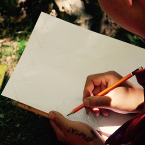
Accuracy is not achieved by tracing alone. A learner first observes a model, then reproduces proportion and stroke order before introducing rhythm and individual adjustment. Cursive hands such as Ume show how the same language can take a more fluid form in motion. This disciplined process also strengthens ordinary handwriting: pressure, alignment, speed and spacing become conscious choices instead of unnoticed habits.
From manuscript skill to digital expression
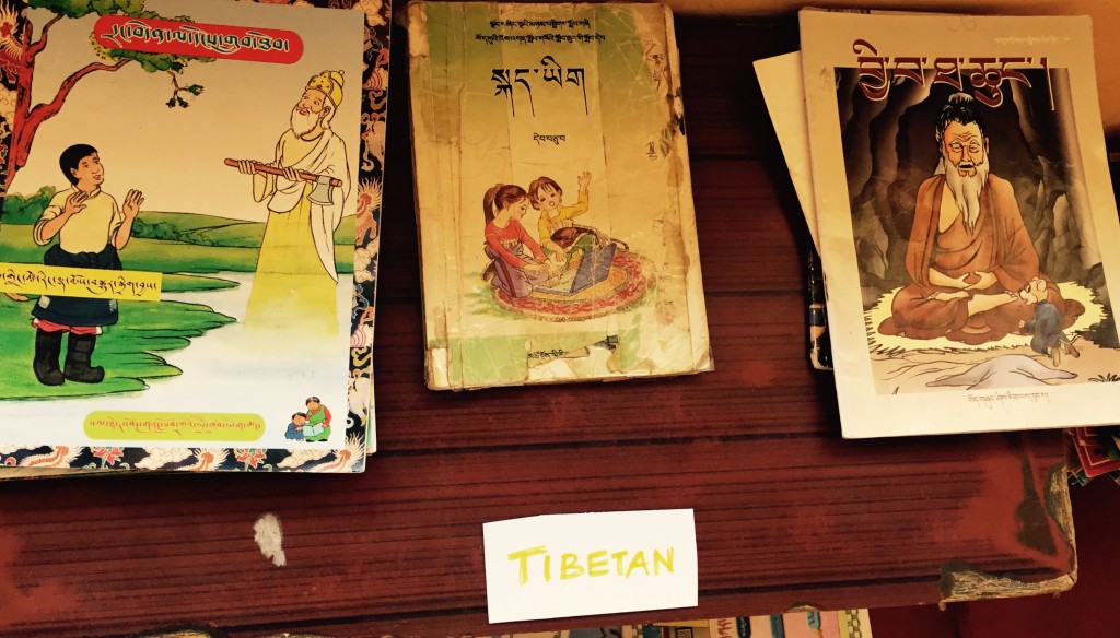
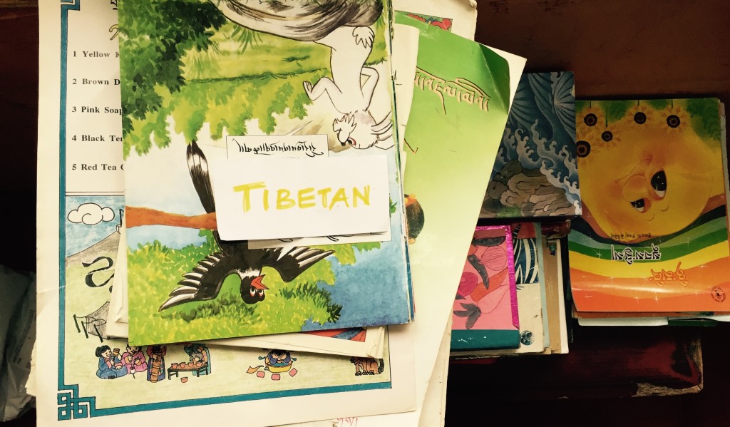
Tibetan calligraphy connects the physical page with the history of reading. Books carried religious teachings, poetry, records and stories, while manuscript work joined disciplined letterforms with patterns, illumination and skilled hand movement. A calligraphy lesson gives students access to that history through the material itself. Instead of viewing books only as sources of information, they can consider how care, patience and beauty are embedded in their construction.
Modern writing extends this encounter rather than replacing it. Students can compare a brush stroke with a pen line, a scanned manuscript with a digital image, or a hand-drawn character with a typeface. Unicode enables Tibetan text to appear on digital devices, although not every font preserves the movement and visual character of handwritten forms. Exploring these differences helps learners understand that handwriting, print and digital text are related yet distinct ways of representing language.
Learning in an Australian setting
Australian learners often move between English handwriting, home languages and images on phones. In Sydney, Melbourne and other cities, public libraries, Buddhist centres and community classes may bring Tibetan and other Himalayan traditions into contact with highly diverse classrooms. This setting makes the bridge especially visible: students can compare Tibetan letter proportions with Latin cursive, familiar print conventions and everyday digital communication without assuming that the scripts share the same language or history.
Daily habits shape what writing means. Many young people type quick notes on a phone, scan worksheets or collaborate on a screen, yet still hand-copy diagrams and use pen-and-paper lists to help them remember information. Specialist art shops, online marketplaces and community workshops supply paper, bamboo pens, brushes and Tibetan calligraphy materials, creating a local market for both tools and classes. Comparing those tools helps learners ask whether digital speed and handwritten expression serve different purposes.
In government schools, state and territory departments implement the Australian Curriculum, whose English strand develops print, handwritten, visual and digital composition. A calligraphy unit can therefore contribute to multiliteracies without replacing language teaching. When published manuscripts or artworks are used, the Copyright Act 1968, licence terms and any applicable fair-dealing exception must also be considered. Cultural permission may go further than copyright law: an image can be legally reusable while remaining inappropriate to reproduce without proper context.
A respectful learning pathway
A useful sequence moves from looking to constrained making, then to interpretation and design. The teacher can begin with a short phrase rather than an isolated decorative character because Tibetan writing carries linguistic and contextual relationships. Demonstrations should show how different tools produce changing lines while preserving the structural rules of the script.
- Begin with the language, script history, purpose and intended audience of each model.
- Teach a small, carefully ordered set of forms, making proportions, spacing and stroke sequence explicit.
- Let learners compare brush, bamboo pen, marker and stylus on the same exercise, noting how each tool changes line quality.
- Pair careful reproduction with invention by having students create a short phrase, poster or digital layout.
- Assess observation, reflection and development through annotated drafts rather than polished appearance alone.
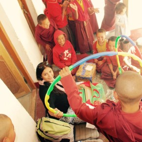
The teacher’s role is to translate the learning goals without claiming ownership of the tradition. Feedback can address proportion, spacing and persistence while leaving room for individual expression. With children and young monks, a shared display of process drafts can reveal growth more honestly than a final exhibition of flawless copies. Community members can also help confirm that cultural explanations and examples have been represented accurately.
Keeping the bridge useful and alive
Tibetan calligraphy should not become a decorative costume attached to literacy. Learners benefit from knowing where a form comes from, which community uses it and whether the text is religious, literary or everyday. In Ladakh, book drives and reading rooms can provide real context for the pages students study. Elsewhere, video conversations and carefully attributed reproductions can extend that context. The aim is continuity through informed interpretation, not an invented hybrid style.
Documentation helps the practice remain meaningful as teaching methods change. High-quality photographs, annotated exercises and learner reflections can show how an individual understands a letter without turning the artwork into an isolated cultural object. When children’s work or community images are shared, consent, ownership and appropriate limits should be agreed upon in advance. Digital tools can preserve this history while also supporting new fonts, books and forms of communication.
The lasting takeaway is practical: one closely observed letterform, one material tested under changing pressure and one contemporary setting for its visual ideas can connect cultural memory with daily reading, making and typing. Through that sequence, calligraphy becomes a bridge carried by curiosity and understood through practice.